Connect with us

Arts and Crafts

Too Many Mittens

My mom has always loved seeing her children be creative, so she was thrilled when I showed interest in learning how to make mittens. So, in 2016, she taught me how to make wool sweater mittens.

Published

on

By: Charity (@trailerparkgirl on BTA)

My mom started making wool sweater mittens sometime around 2014. She got the idea from visiting a local Mennonite-owned store. She found patterns online and started out just making them for the family. We’re a family of ten, so there are plenty of us to make mittens for.

In 2015, at eighteen, I became her right-hand businesswoman and began photographing her mittens and selling them on Etsy. My younger sister, Madeline, drew the mitten in the shop logo.

My mom called her shop “Too Many Mittens.” She may or may not have gotten the idea for the name from the 1958 children’s book “Too Many Mittens.”

It’s one of a few books she remembers from her childhood. My mom grew up in the Upper Peninsula of Michigan, and the story takes place in Michigan. 

My mom has always loved seeing her children be creative, so she was thrilled when I showed interest in learning how to make mittens. So, in 2016, she taught me how to make wool sweater mittens. I found them to be pretty simple to make. Very fun, too. I already had some experience with sewing, so it didn’t take long to get the hang of mitten-making. The excitement of pairing different wool sweater fabrics together and adding cool buttons to the cuffs was enough to get me hooked.

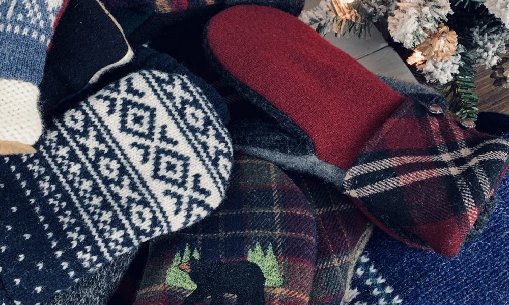
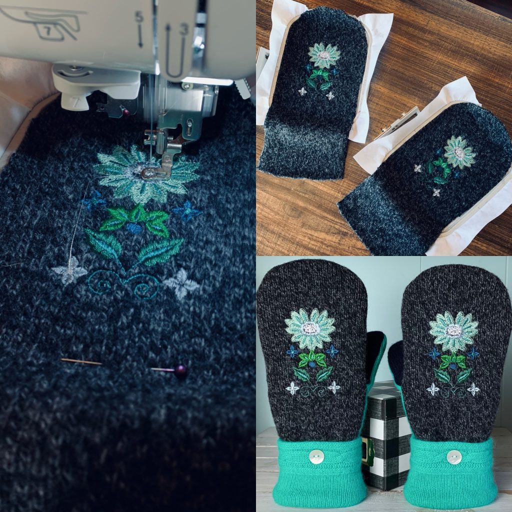
We make the mittens out of wool sweaters from thrift shops. And we line the mittens with fleece. My mom and I have had a blast sifting through thrift shop clothes racks in search of funky wool sweaters. We’ve gone through hundreds of wool sweaters in the past several years. Sometimes I see a sweater that I love so much that I’m tempted to keep it for myself to wear. But then I think, “Nah, that’ll make some really cool mittens.”

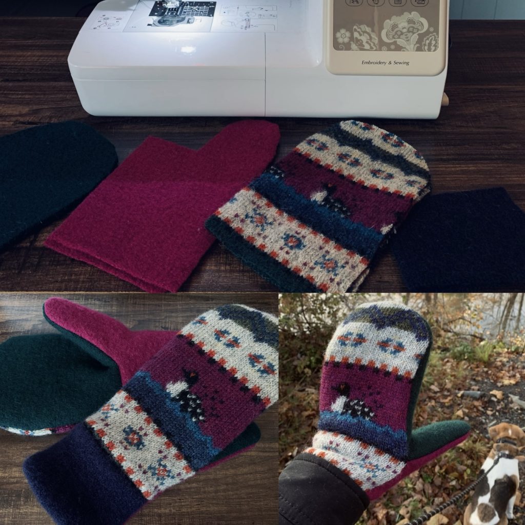
A few years ago, I invested in an embroidery sewing machine and lots of machine-embroidery thread. It’s been lots of fun to play around with different designs on mittens. They really give mittens extra character. The machine was definitely worth it. And it was fairly affordable. I use a Brother SE625. 

Now, in 2022, my mom is far too busy for making mittens. She’s focused on helping raise some of her grandchildren. So, my mom decided to let me take over Too Many Mittens. I’m planning on adding other handcrafted goods to our shop in the future, like cold-process soap. I’ve been playing around with soap-making since 2018. I’m currently working on perfecting recipes. My goal is to have soap available by Spring 2023. I’m even trying to get my younger sister to design the labels for the soap. After all, it is tradition. 

One day, I hope my mom will have some extra time on her hands so that she can get back into making mittens. She really enjoyed it, just like I do. Together, we have sold over 350 pairs of mittens. I’m grateful for the time we’ve been able to bond because of our mutual love of mitten-making. If I ever have a daughter of my own, I plan to teach her how to make wool sweater mittens and so many other wonderful things.

Visit my Etsy shop, Too Many Mittens, Here!

Bears get 15% off with the code: TRAILERPARKGIRL

Arts and Crafts

Announcement: Beartaria Times National Festival Poster Contest

We want to announce a fun and friendly contest for a poster design for our National Festival this year.

Published

on

Calling All Artists!

We want to announce a fun and friendly contest hosted by BudBear, for a poster design for the Beartaria Times National Festival this year.

BudBear will accept submissions until August 24th.

Twelve finalists will be selected, and their designs will be printed and sold at the festival. Whoever sells out of 100 copies or sells the most by the end of the festival will be the grand prize winner with bragging rights and could allegedly receive a copy of their design signed by the Big Bear himself.

Designs should be digital renderings, 12×18 inches vertical, and 300 dpi. As always, please keep it to the clean and family-friendly standards of The Beartaria Times Community.

All proceeds will be donated to Beartaria Ozark Campground at BeartariaCampgrounds.com

Poster designs can be submitted to bearposters33@gmail.com for consideration.

Continue Reading

Arts and Crafts

A Pointed Pen Calligraphy Tutorial

The fun thing about calligraphy is that there are many scripts, many pens, and many styles to learn.

Published

on

By: Snow White Bear

Pointed pens have pointed tips. They come in straight and oblique holders.

Some pens can do both. Choose whichever is more comfortable.

First, clean your nib by putting it in your mouth for a few seconds (older calligraphers still do this), or get a potato from your garden and stick all your nibs in it (a minute should be enough, but some do this overnight) or my favorite using up all the unnatural toothpaste the dentist gives you to clean your nibs. If you skip this step, I’ll get a message from you saying, “Snow White Bear, I tried to write, but the ink won’t come out.”  For ink, any calligraphy ink will work. Thinner ink is easier to work with; slowly add distilled or filtered water. Walnut ink can be made at home or bought and is easy to work with. Iron gall ink is tremendous but slowly eats at the nib. “Dinky dips” are popular for pouring ink in.

Don’t use printer paper.  Any paper that is 32lbs or more (Hp 32lbs is popular) and smooth will work. Some like resume paper even though it has a slight texture. I print calligraphy guidelines I find online on these papers then I’m ready to practice.

Pointed pens are great at Copperplate script. Here are the basic strokes: 

Always write using guidelines. Traditionally Copperplate is written at 55 degrees. Practice the basic strokes until you can do them at least 80% consistently. Now it’s time to move on to letters. Letters are made up of basic strokes. The basic strokes usually group the letters they are composed of. 

Practice and practice writing letters and practice writing them slowly. You know when you’re going too fast when your pen keeps scratching or skipping on the page. Clean your pen with water and a paper towel every once in a while when writing after letters are mastered, and practice many words with attention to letter connections (I’ve seen this be a whole course) and spacing. Traditionally calligraphers are taught to practice pangrams like “The quick brown fox jumps over the lazy dog.” Writing long phrases can help master spacing and words more quickly. Next, majuscules and capital letters are learned, and unfortunately, they use different basic strokes and spacing than the minuscules or lower cases letters.

There are other scripts one can write with a pointed pen. Spencerian, a script invented in America by Platt Rogers Spencer, is the second most popular. My favorites are Engrosser Script, Italian Hand, and Open-Shaded Script. 

Modern calligraphy is based on traditional calligraphy but stylized differently. Although you don’t have to learn traditional calligraphy first, many calligraphers recommend it. What’s fun about modern is that after you practice hard and learn the rules, you make your own style. 

The fun thing about calligraphy is that they are many scripts, many pens, and many styles to learn. I only mentioned a few. It’s technical art that is limitless, and you keep improving your script every time you practice. 

My favorite calligraphy resources:

Traditional calligraphy online lessons:

logoscalligraphy.com

Dreaming in Script by David Grimes 

https://www.dreaminginscript.com/

zanerian.com has free lessons

Modern calligraphy online lessons:

The happy ever crafter on youtube

Calligraphy supplies:

https://www.johnnealbooks.com/

https://www.paperinkarts.com/

Join your local Calligraphy guild.

-Snow White Bear

Continue Reading

Arts and Crafts

Illustrating a Children’s Book

Show your work early and often. In your communications with the writer, show them your thumbnails, scribbles, and roughs. As artists, we have a tendency to cloister away until we have a polished piece of art; this tendency is detrimental to collaborations.

Published

on

Illustrating a Children’s Book

So you wrote a children’s book, now what? This article will help writers understand the illustration process and help artists come up with a plan to tackle a picture book project. After working on quite a few children’s books in the past two years, I’d like to share some tips on the process of creating them.

First, you must answer a few questions:

How many pages?

Traditionally, the standard picture book format has 32 inside pages, with the first 4 taken up by copyright, barcodes, and other interesting bits and bobs. That means we have a total of 28 pages to work with in terms of illustrations.

But since the advent of print-on-demand publishing, book lengths have become much more flexible. However, it’s good to keep in mind that the traditional length is what parents and children (a.k.a. your potential readers) are used to, and deviating from it may be a jarring reading experience.

What trim size?

(A few of the available trim sizes.)

Trim size is basically the size of the book. Square books are popular for children, but letter size is also a respectable format. Horizontal picture books are very classy, but not many print-on-demand services offer them. It’s best to research the printers you want to use (KDP, Ingram Spark, Lulu, Blurb, etc.) and then decide which is best for the project.

How many illustrations?

It may be tempting to want a picture on every page, but the picture-to-text ratio is determined primarily by the intended age of the reader. As a rule of thumb, the younger the target audience, the more pictures you’ll want in the book.

Color or black and white?

(Black and white interior illustration for “The Lion Who Forgot”)

You may be wondering why a children’s book would not have color, but as we discussed above, older children often don’t need hyper-colorful images to hold their attention. If you’re illustrating for the 9-12 age range, some stylish black and white ink drawings may be more appropriate, depending on the subject matter.

There are exceptions to this rule; young children are sensitive to high contrasting images, so simple black and white images such as in “The Lion Who Forgot” will work well. 

Another consideration is that color printing will be more expensive than black and white; the more vibrant and intricate the illustrations, the better printing quality you’ll need to use.

Is your style a good fit for the book?

Younger kids like big heads and big eyes that emote clearly; older children can appreciate more sophisticated compositions and moods in a landscape. What’s your strong suit?

One of the best pieces of advice I’ve gotten when I was starting out in art was to never accept a project that doesn’t jive with your style because each project builds your portfolio in a direction you don’t really enjoy. And since you’ll be hired based on your portfolio, your career might take a turn in a direction different from your true talent.

Once you’ve answered these questions and have determined to accept the job, it’s time to take the next step.

The planning phase

1. Thumbnails— your Roadmap

(Thumbnails for “The King’s Colt”)

There are many places online where you can download a thumbnails template. These make it easy for you to see the whole story at a glance and spot obvious story flow issues early.

This is also the best time to work out your creative differences with the writer and avoid the nightmare of revising a fully finished illustration because you didn’t hash it out early.

Thumbnails guide you as you illustrate your way through the manuscript and gives you an easy way to scope out the project and count the cost before building the tower, if you will.

2. The test page and character designs

From the thumbnails, pick a page that has the main character(s), and take it all the way to the finalized stage. Take note of the techniques you’ve used and how long it took you to do them. This allows you to figure out your process and accurately assess the total amount of work involved in the project. From this one exercise, you can extrapolate the amount of time needed for the whole book, the budget the writer will need to come up with for hiring you, and as a bonus, the main character’s design is now hammered out too.

If the writer agrees to go ahead with the style, design, budget, and estimated timeline determined by the test page, you are now safe to dig into the production phase of the illustrations.

3. Streamline your art process

If you’ve paid proper attention to your process during the test page, you should be able to replicate that process for each book page. However, there is inevitably a style shift when a project spans weeks and months, and I’ve found the easiest way to keep the whole book cohesive, and the style consistent is to streamline the process.

This means doing the rough drafts of all the pages, then the line art of all the pages, and finally the color and paint of each page. This may look different for you, but the principle holds; finish the whole book in one stage before moving on to the next.

4. A few technical considerations

When designing your illustrations, keep in mind the following:

• The spine will pinch the middle of the book, so each page has a strip at the spine that will be hidden. That is called the “gutter.”

• Around each page, there is a border that may get accidentally trimmed. It’s best to keep essential bits like faces and text away from that border; this is called the “margin” or “safety.”

• Do your images go all the way to the edge of the page? If so, you’ll need to include an extra “bleed” border around your page, where the image continues to bleed past the edge of the trim size.

The printing service you use should be able to provide a template peculiar to your book’s specifications. Download that template and follow it to the pixel.

5. Formatting the text

(Contrasting text example from “The Peanut Trap”)

There are a few options when it comes to displaying the text. Firstly, your pictures should be composed with the text in mind to integrate nicely. To make the text legible, you’ll need to have the background in a contrasting tone to the text—i.e., dark text, light background, or light text, dark background. There are a few ways of achieving this. If your illustrations don’t have that contrast, you can use a box, a banner, or a speech bubble. 

Another often overlooked option is to format the whole book to have a blank facing page dedicated to text. This is actually an excellent option for all ages, so make sure to discuss the option with the writer you’re working with.

(Example of facing-page text and text on banner)

Some final thoughts

Show your work early and often. In your communications with the writer, show them your thumbnails, scribbles, and roughs. As artists, we have a tendency to cloister away until we have a polished piece of art; this tendency is detrimental to collaborations.

(Hilarious simple thumbnail to final for “Aurora Bearialis”)

The writer may not understand your thumbnails at the outset, but as you take them through your process, they will acquire more and more educated eyes. I can confidently say that the writers of “Aurora Bearialis” are able to decipher my scribbles now.

I hope you found this article useful. Of course, there’s nothing like lessons learned by doing, so go forth and create, my brothers and sisters!

-HandDrawnBear   

http://www.handdrawnbear.com

Continue Reading

Trending

We use cookies to ensure that we give you the best experience on our website.