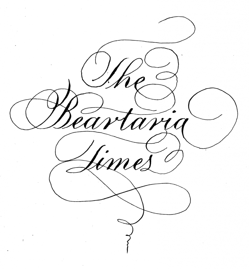
Arts and Crafts
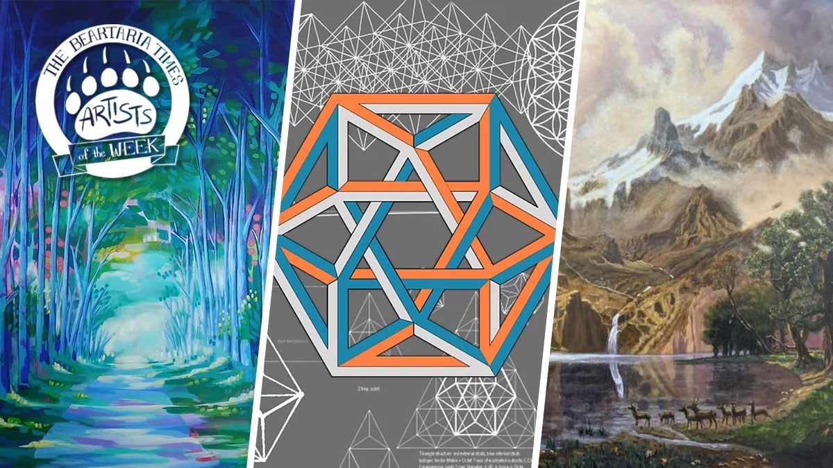
September 28th 2020 Artists of the week
Beartarian artists and crafters, THANK YOU SO MUCH! We had so many great artists share their work this past week and it was a pleasure to see. Your work is inspiring and we are thankful that you chose to share your creations with us. Please continue to share your arts and crafts with us for a chance to be featured each week here, at Beartaria Times!
Please send all Artists of the Week submissions directly to arts@beartariatimes.com.
Below are September 28th, 2020 Artists of the week!
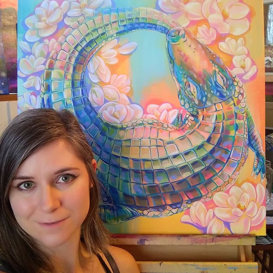
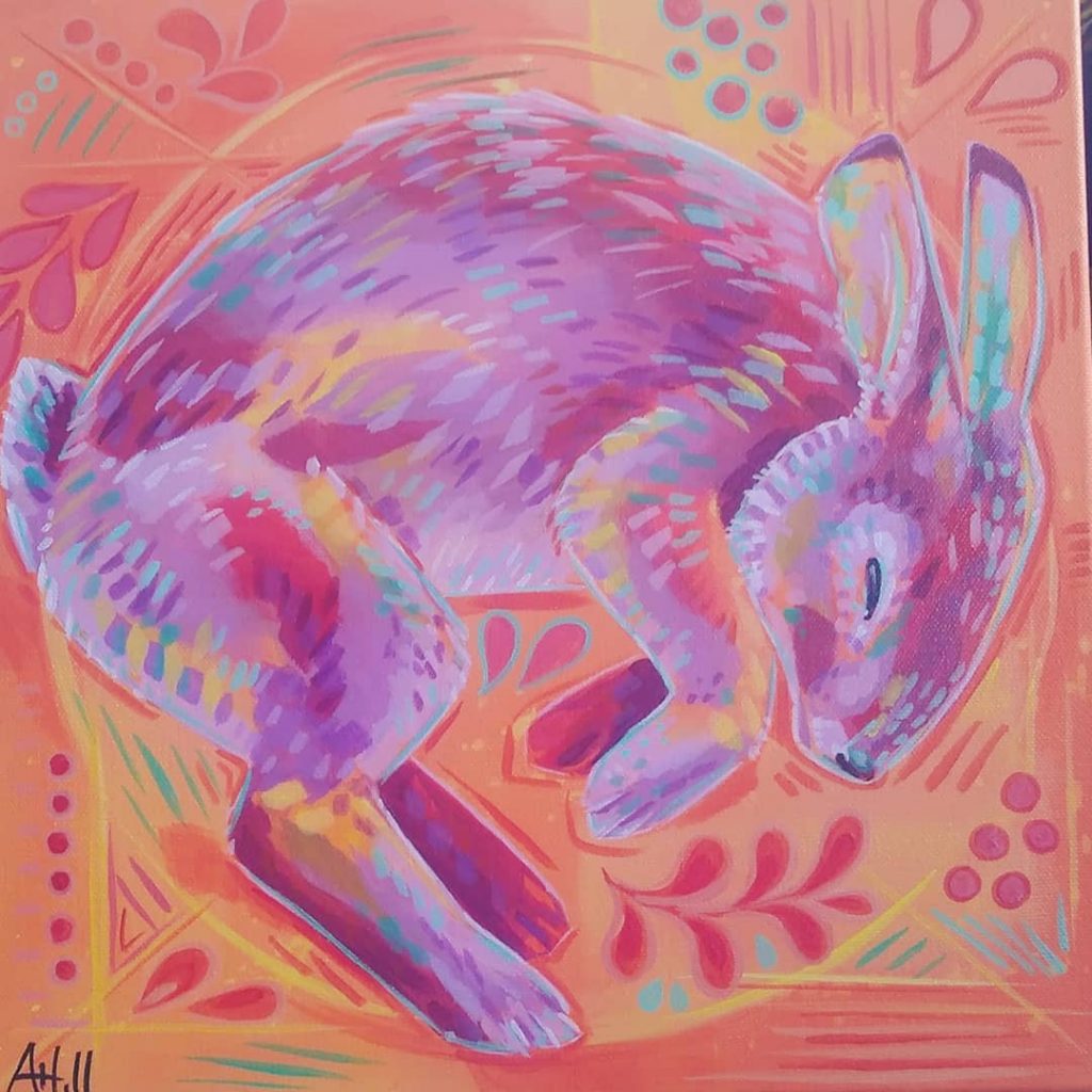
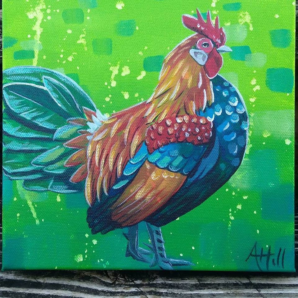
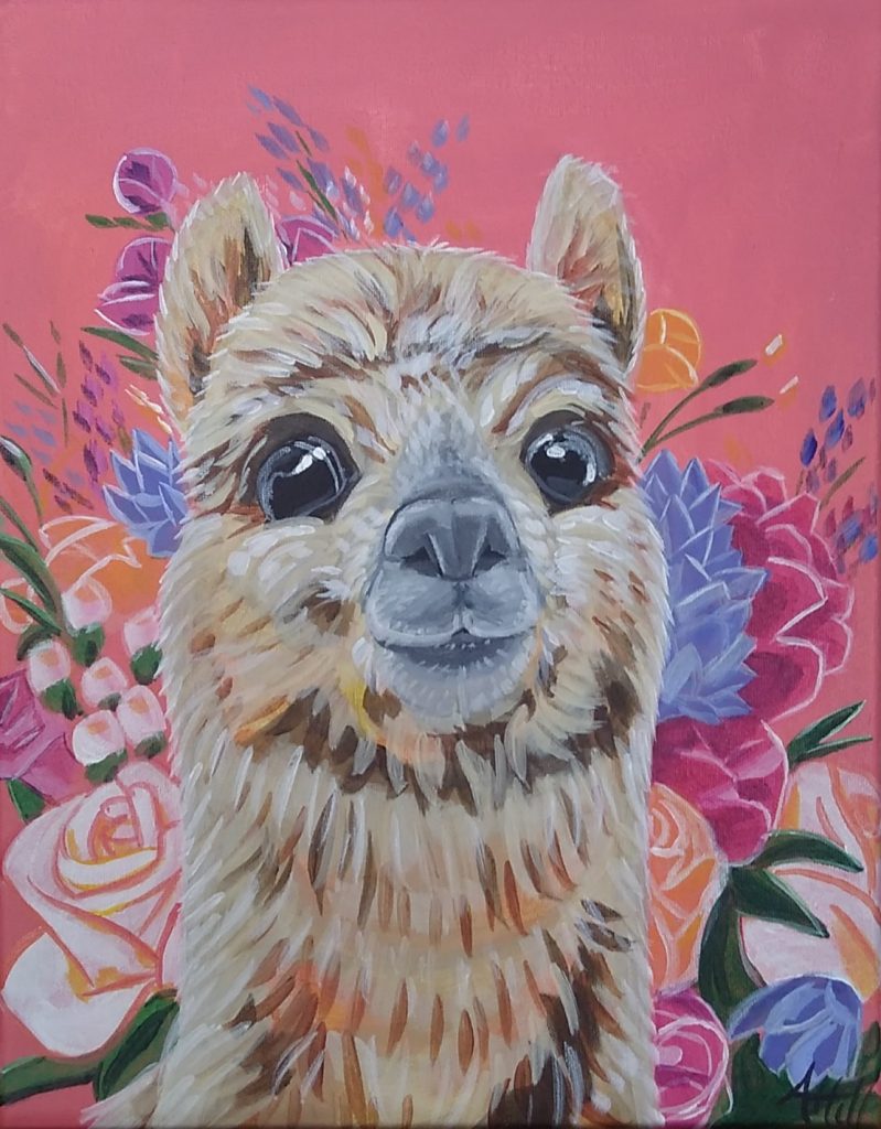
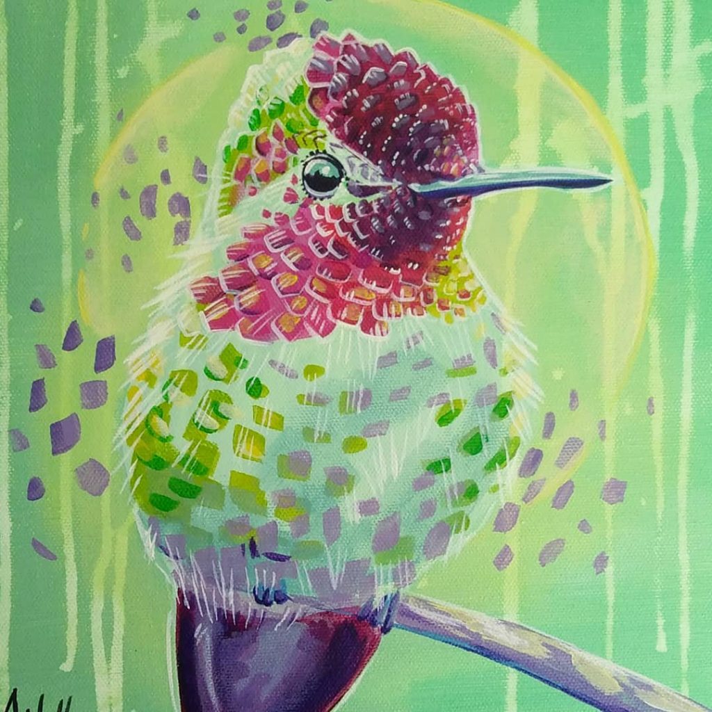
Ally Hill
allyhillart.com | Ally’s Facebook | Ally’s Instagram
I’ve lived in Virginia most of my life, but my Cajun roots shine through in my paintings. I’ve been drawing for as long as I’ve been able to hold a pencil, but my first desire for painting was as a young girl, when I saw the large murals decorating the buildings of my hometown of Jennings, Louisiana. It was a “spark” creating my love for painting.
Acrylic is my preferred medium – and the support of my husband, Michael, has given me the encouragement to develop my own unique, self-taught artistic style. I find that the bold and vibrant acrylics allow me to explore the energy and beauty of nature. Now living in central Virginia, I spend my days painting, gardening, and homeschooling my three young daughters. I believe that art, and the act of creation in Truth, helps to link mankind to the great Creator.


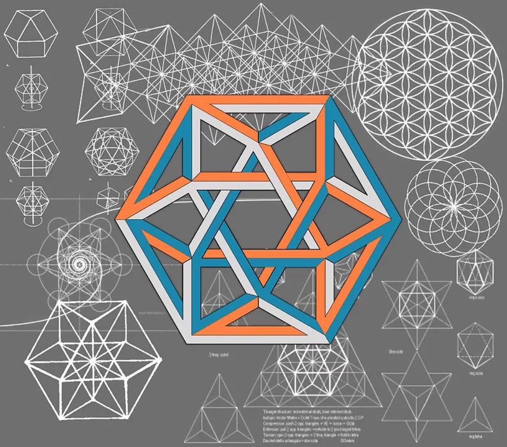
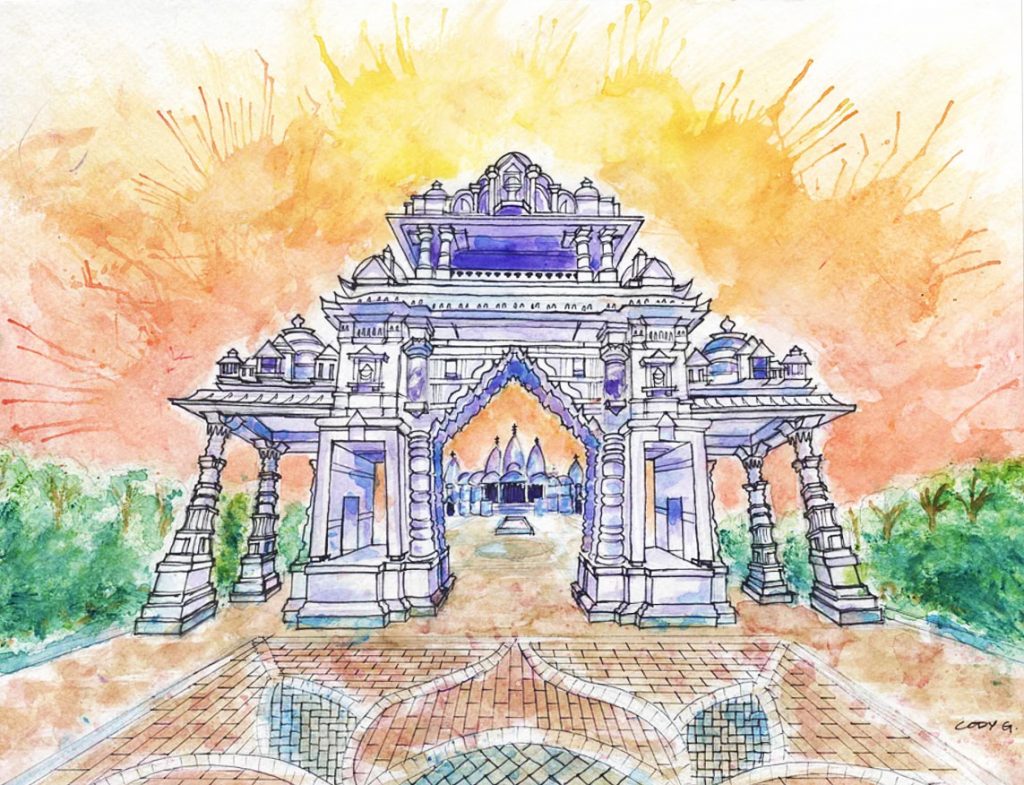
Cody Gatlin | Number12 Bear
CodyGatlin.com | Cody’s Instagram
I went to Architecture School at UNC Charlotte, in North Carolina, where I grew up. After graduating in 2011 I moved to Austin, TX, mainly because it was the home of Stevie Ray Vaughan and I’m a blues guitarist behind closed doors. I eventually found a job at an Architecture firm, worked there for about 5 years, and then went out on my own and started my own business, Cody Gatlin Design, inc. I have been doing freelance design of all kinds for the past 8 years. From video editing to Mexican tile design, web design, architecture & album covers. I love sacred geometry, and since becoming a born-again Christian in 2017, the geometry of nature has been an elevated inspiration to me. Like many others, I am pursuing the homesteading lifestyle. I moved away from Texas and now spend my time between Johnson City, TN and Lincolnton, NC. A quote I try to live by is, “Strive not to be a man of success, but rather a man of value”.
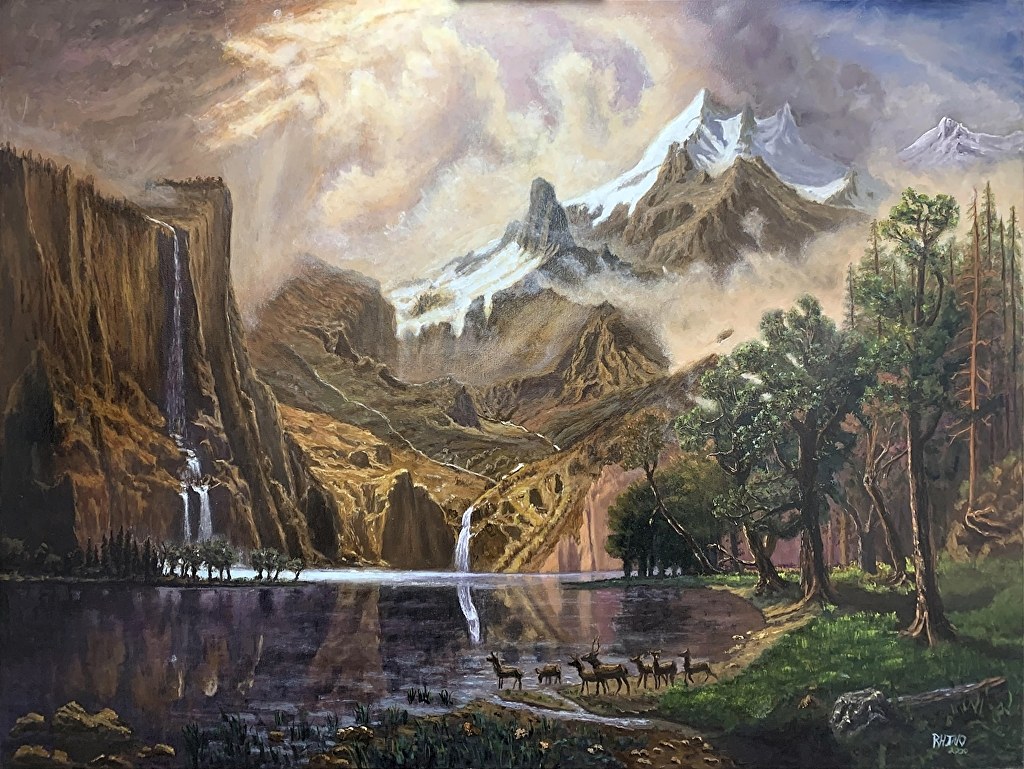
AJ Rhino Bear
ajrhino.com | AJ Rhino’s Instagram | AJ Rhino’s D-Live
I started painting in April of 2017 after a life changing moment where I hit rock bottom both literally and metaphorically. I came out of it knowing that God is real, God is good, and for some reason, He wants me to paint pretty pictures. I’ve been working really hard at increasing my skills and the bears have been Extremely supportive. I love this community. It’s a blessing to be a part of it.
This is one of my paintings. It is a study of a famous Bierstadt painting. It is 48×36″ oil on canvas and it took me 55 days. I live streamed the entire process…well almost. The bears were encouraging me the whole way and it was a terrific experience. I learned so much doing it that my work since then is getting better and better. Then last week, I took a solo trip to yellowstone and saw with my own eyes, what mountains really look like. Time to level up again.
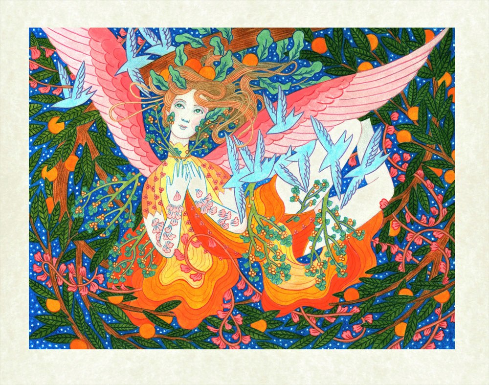
Anjipan | jibear
anjipan.com | Anjipan’s Instagram
‘Absolution’ is an illustration which was created for a local art show themed, ‘Horror Vacui’. Horror Vacui means ‘fear of empty space’, a style of artwork where the artist fills the entire plane of the piece with detail. With this painting, I opposed the very definition of the theme, while also applying it to my composition. God fills every space, with Him there is no emptiness. Therefore, we should never ‘fear the empty’. Or fear at all.
Title: ‘Absolution’ (2019)
Size: 9×12 inches
Media: Ink and colored pencil on Bristol
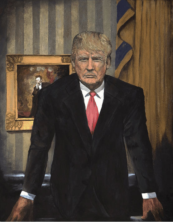
Kyle S. Warren
My name’s Kyle, I’m in Central Texas and a member of CTX Sleuth. My family and I are homesteaders, and I’m currently building a 1200 foot fence, with the help of some local bears. I just enjoy creating things!
Below is my submission entitled “Mister President.” I painted it when I read that 12 prominent artists refused to paint the man’s portrait a few years back. I sent a copy to the white house, and I got a thank you in the form of an official letter from Donny boy.
Thank you again to all of the wonderful artists who shared their art!
We look forward to seeing all the arts and crafts you send our way. Continue to create and seek the Good, the Beautiful, and the True. Onward to Beartaria!
You can find out more about the Artists of the Week here.
Sincerely,
MC-Bear

Arts and Crafts
Announcement: Beartaria Times National Festival Poster Contest
We want to announce a fun and friendly contest for a poster design for our National Festival this year.

Calling All Artists!
We want to announce a fun and friendly contest hosted by BudBear, for a poster design for the Beartaria Times National Festival this year.
BudBear will accept submissions until August 24th.
Twelve finalists will be selected, and their designs will be printed and sold at the festival. Whoever sells out of 100 copies or sells the most by the end of the festival will be the grand prize winner with bragging rights and could allegedly receive a copy of their design signed by the Big Bear himself.
Designs should be digital renderings, 12×18 inches vertical, and 300 dpi. As always, please keep it to the clean and family-friendly standards of The Beartaria Times Community.
All proceeds will be donated to Beartaria Ozark Campground at BeartariaCampgrounds.com
Poster designs can be submitted to bearposters33@gmail.com for consideration.
Arts and Crafts
Too Many Mittens
My mom has always loved seeing her children be creative, so she was thrilled when I showed interest in learning how to make mittens. So, in 2016, she taught me how to make wool sweater mittens.
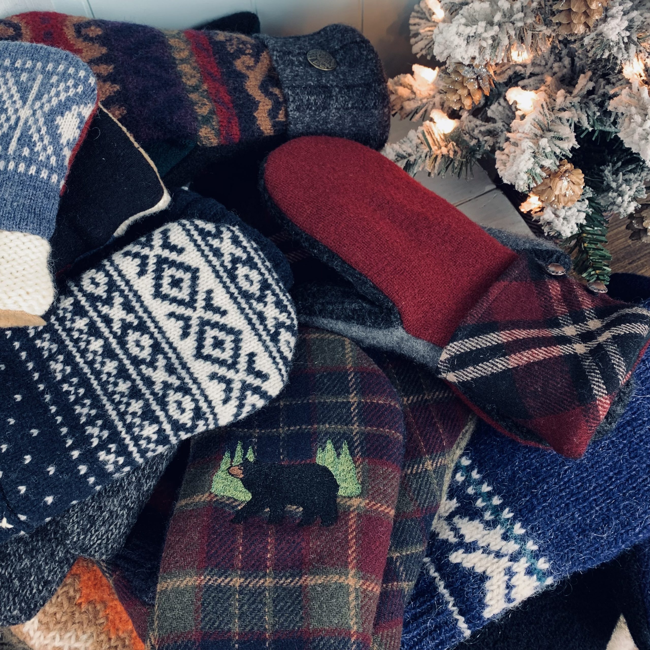
By: Charity (@trailerparkgirl on BTA)
My mom started making wool sweater mittens sometime around 2014. She got the idea from visiting a local Mennonite-owned store. She found patterns online and started out just making them for the family. We’re a family of ten, so there are plenty of us to make mittens for.
In 2015, at eighteen, I became her right-hand businesswoman and began photographing her mittens and selling them on Etsy. My younger sister, Madeline, drew the mitten in the shop logo.
My mom called her shop “Too Many Mittens.” She may or may not have gotten the idea for the name from the 1958 children’s book “Too Many Mittens.”
It’s one of a few books she remembers from her childhood. My mom grew up in the Upper Peninsula of Michigan, and the story takes place in Michigan.
My mom has always loved seeing her children be creative, so she was thrilled when I showed interest in learning how to make mittens. So, in 2016, she taught me how to make wool sweater mittens. I found them to be pretty simple to make. Very fun, too. I already had some experience with sewing, so it didn’t take long to get the hang of mitten-making. The excitement of pairing different wool sweater fabrics together and adding cool buttons to the cuffs was enough to get me hooked.
We make the mittens out of wool sweaters from thrift shops. And we line the mittens with fleece. My mom and I have had a blast sifting through thrift shop clothes racks in search of funky wool sweaters. We’ve gone through hundreds of wool sweaters in the past several years. Sometimes I see a sweater that I love so much that I’m tempted to keep it for myself to wear. But then I think, “Nah, that’ll make some really cool mittens.”
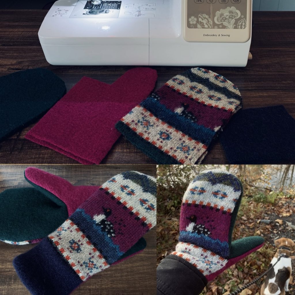
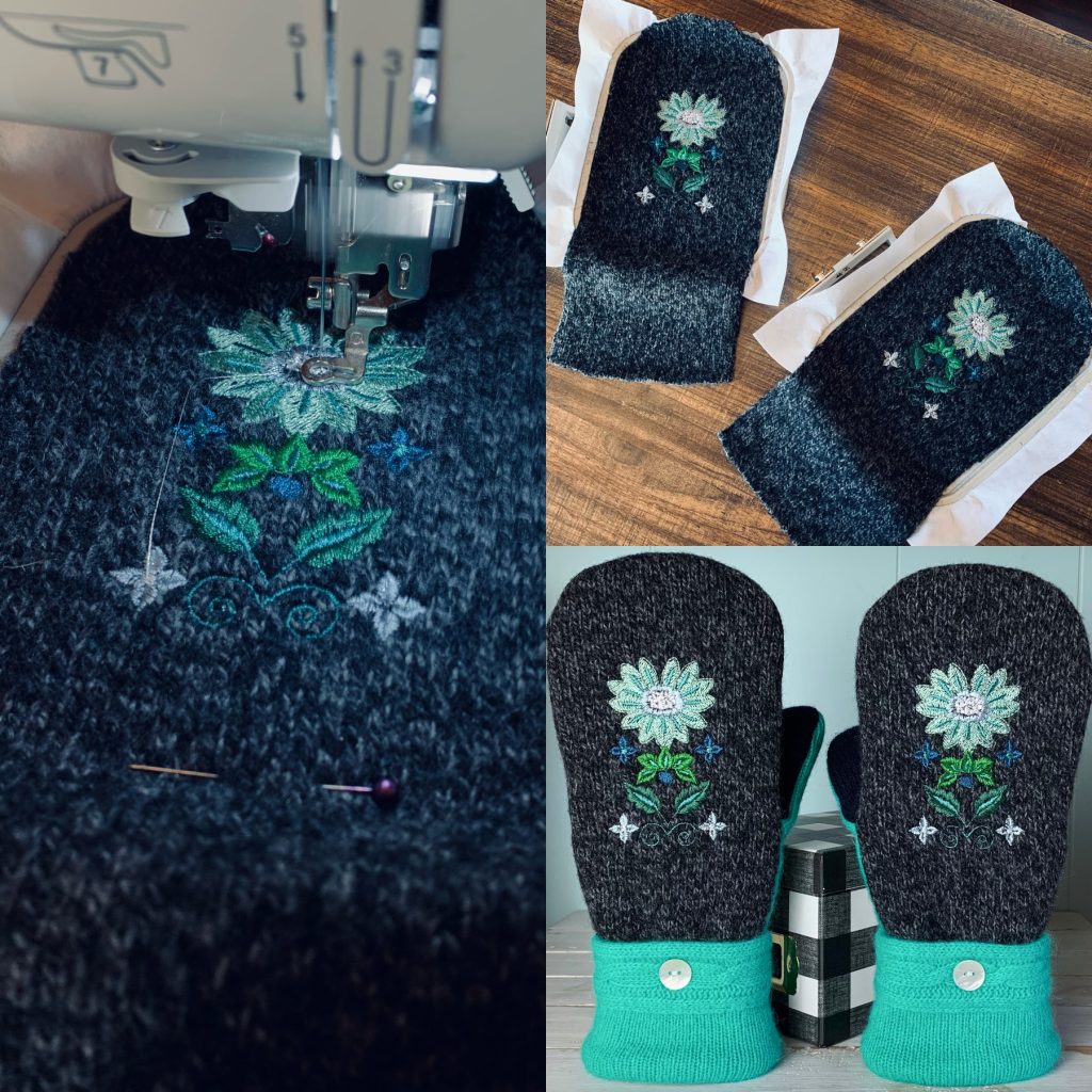
A few years ago, I invested in an embroidery sewing machine and lots of machine-embroidery thread. It’s been lots of fun to play around with different designs on mittens. They really give mittens extra character. The machine was definitely worth it. And it was fairly affordable. I use a Brother SE625.
Now, in 2022, my mom is far too busy for making mittens. She’s focused on helping raise some of her grandchildren. So, my mom decided to let me take over Too Many Mittens. I’m planning on adding other handcrafted goods to our shop in the future, like cold-process soap. I’ve been playing around with soap-making since 2018. I’m currently working on perfecting recipes. My goal is to have soap available by Spring 2023. I’m even trying to get my younger sister to design the labels for the soap. After all, it is tradition.
One day, I hope my mom will have some extra time on her hands so that she can get back into making mittens. She really enjoyed it, just like I do. Together, we have sold over 350 pairs of mittens. I’m grateful for the time we’ve been able to bond because of our mutual love of mitten-making. If I ever have a daughter of my own, I plan to teach her how to make wool sweater mittens and so many other wonderful things.
Visit my Etsy shop, Too Many Mittens, Here!
Bears get 15% off with the code: TRAILERPARKGIRL
Arts and Crafts
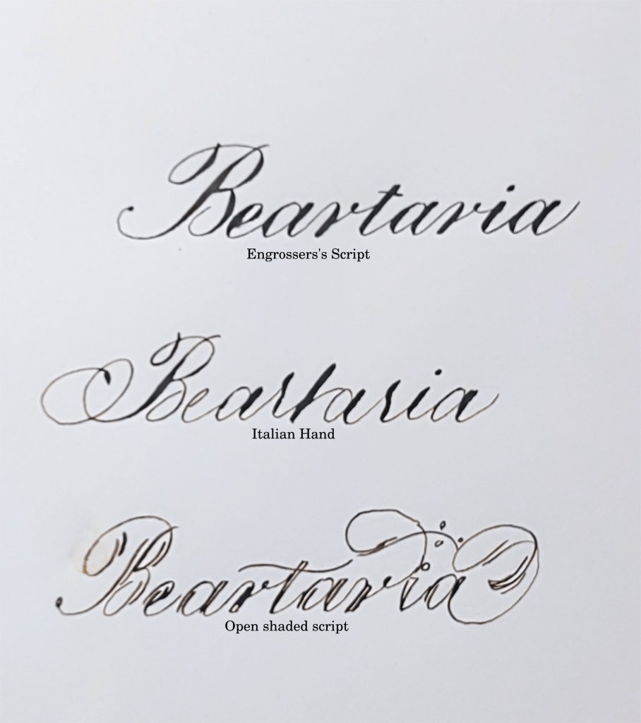
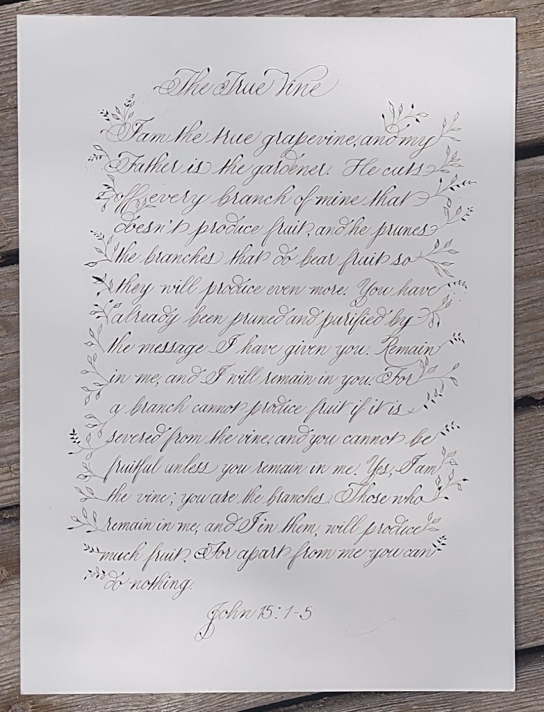
A Pointed Pen Calligraphy Tutorial
The fun thing about calligraphy is that there are many scripts, many pens, and many styles to learn.
By: Snow White Bear
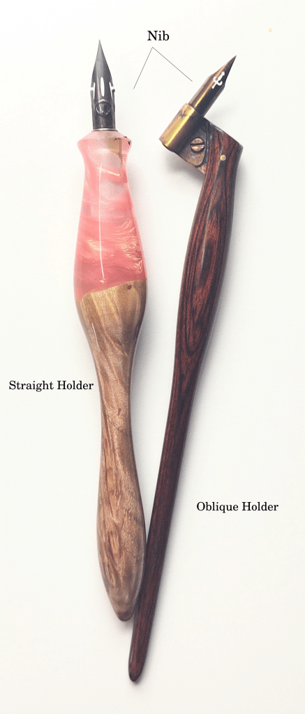
Pointed pens have pointed tips. They come in straight and oblique holders.
Some pens can do both. Choose whichever is more comfortable.
First, clean your nib by putting it in your mouth for a few seconds (older calligraphers still do this), or get a potato from your garden and stick all your nibs in it (a minute should be enough, but some do this overnight) or my favorite using up all the unnatural toothpaste the dentist gives you to clean your nibs. If you skip this step, I’ll get a message from you saying, “Snow White Bear, I tried to write, but the ink won’t come out.” For ink, any calligraphy ink will work. Thinner ink is easier to work with; slowly add distilled or filtered water. Walnut ink can be made at home or bought and is easy to work with. Iron gall ink is tremendous but slowly eats at the nib. “Dinky dips” are popular for pouring ink in.
Don’t use printer paper. Any paper that is 32lbs or more (Hp 32lbs is popular) and smooth will work. Some like resume paper even though it has a slight texture. I print calligraphy guidelines I find online on these papers then I’m ready to practice.
Pointed pens are great at Copperplate script. Here are the basic strokes:
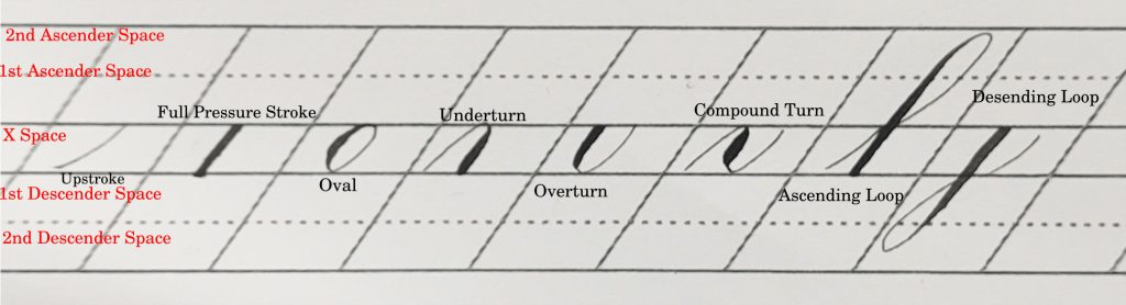
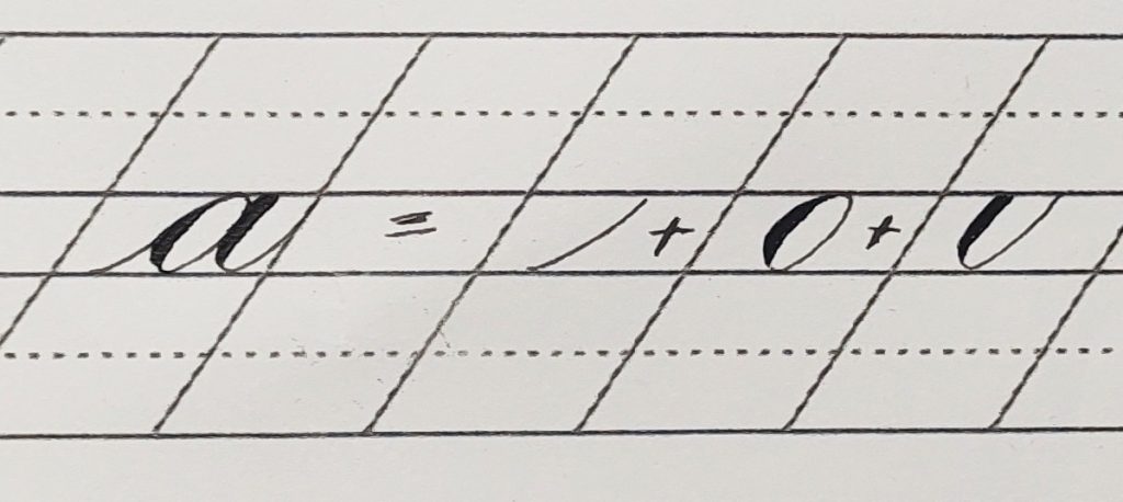
Always write using guidelines. Traditionally Copperplate is written at 55 degrees. Practice the basic strokes until you can do them at least 80% consistently. Now it’s time to move on to letters. Letters are made up of basic strokes. The basic strokes usually group the letters they are composed of.
Practice and practice writing letters and practice writing them slowly. You know when you’re going too fast when your pen keeps scratching or skipping on the page. Clean your pen with water and a paper towel every once in a while when writing after letters are mastered, and practice many words with attention to letter connections (I’ve seen this be a whole course) and spacing. Traditionally calligraphers are taught to practice pangrams like “The quick brown fox jumps over the lazy dog.” Writing long phrases can help master spacing and words more quickly. Next, majuscules and capital letters are learned, and unfortunately, they use different basic strokes and spacing than the minuscules or lower cases letters.
There are other scripts one can write with a pointed pen. Spencerian, a script invented in America by Platt Rogers Spencer, is the second most popular. My favorites are Engrosser Script, Italian Hand, and Open-Shaded Script.
Modern calligraphy is based on traditional calligraphy but stylized differently. Although you don’t have to learn traditional calligraphy first, many calligraphers recommend it. What’s fun about modern is that after you practice hard and learn the rules, you make your own style.
The fun thing about calligraphy is that they are many scripts, many pens, and many styles to learn. I only mentioned a few. It’s technical art that is limitless, and you keep improving your script every time you practice.
My favorite calligraphy resources:
Traditional calligraphy online lessons:
Dreaming in Script by David Grimes
https://www.dreaminginscript.com/
zanerian.com has free lessons
Modern calligraphy online lessons:
The happy ever crafter on youtube
Calligraphy supplies:
https://www.johnnealbooks.com/
Join your local Calligraphy guild.
-Snow White Bear

New Vendors, Workshops and Events At The 2024 Beartaria Times National Festival! (Bean Spilling)

Prepare For The Future You Don’t Want…

Applications Now Open For Topher’s Dome Building Workshop

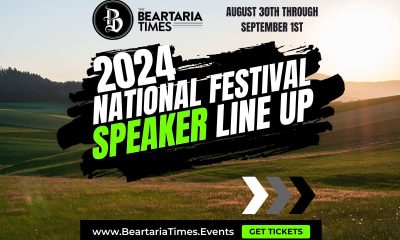
National Festival Speaker Line-Up Announced!

Christopher Gardner Completes First Dome Framing Project in Missouri: Exclusive Interview

Making Pine Needle Soda: A Fantastic Foraged Beverage

3000 Members In Our Business Group!: This Week On Our Community App!

Beartaria Ozark Campground Kicks Off This Year’s Campaign!

Cicada Shells Are Beneficial For Your Garden?

Beartaria Times Member Shares History and Benefits of Haymaker’s Punch

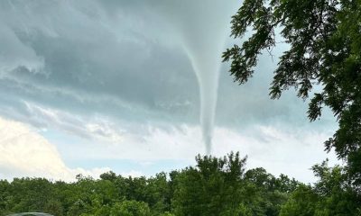
Report: EF-1 Tornado Touches Down In The Ozarks

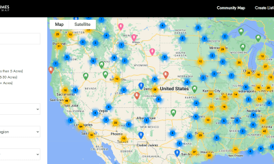
Map it! – Discover Beartarians Living, Working, and Crushing Near You!

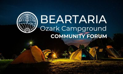
Beartaria Ozark Campground Launches Community Forum!

Why Do We Feel So Free?

Reconnect and Rejoice: Beartaria Times Weekly Challenge
Applications Now Open For Topher’s Dome Building Workshop
Prepare For The Future You Don’t Want…
New Vendors, Workshops and Events At The 2024 Beartaria Times National Festival! (Bean Spilling)
National Festival Speaker Line-Up Announced!

“The Donkey Who Carried The Ark” – A New Children’s Book by HandDrawnBear

Brett Pike- Founder of ClassicalLearner.com Launches New YouTube Channel

A look at This Year’s Fourth of July Northeast Crushfest

The Beartaria Times National Festival Tickets Are Now Up For Sale!

A Review and Commentary of Olive Tree Bear’s Hit Song “My Tribe”

Midwest Bear Fest Recap and Reflection

‘And Then There Was “Crushfest”‘

Medieval Greenhouse On The Prairie

Onward Beartaria – Anchor Bear
-

 Just Crushing2 weeks ago
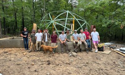
Christopher Gardner Completes First Dome Framing Project in Missouri: Exclusive Interview
-
Just Crushing2 months ago
Beartaria Ozark Campground Launches Community Forum!
-
Just Crushing2 months ago
Map it! – Discover Beartarians Living, Working, and Crushing Near You!
-
Just Crushing2 months ago
Why Do We Feel So Free?
-
Lifestyle2 months ago
Reconnect and Rejoice: Beartaria Times Weekly Challenge
-
Reports2 months ago
Report: EF-1 Tornado Touches Down In The Ozarks
-
Business2 months ago
3000 Members In Our Business Group!: This Week On Our Community App!
-
Wellness2 months ago
Beartaria Times Member Shares History and Benefits of Haymaker’s Punch